Lead Designer Google March - December 2017
The Challenge
Firebase Test Lab is a cloud-based testing infrastructure for Android and iOS apps. When I started on the Test Lab team, a coworker and I sat down to do an audit of the feature’s user analytics. We quickly discovered an alarming trend: a steep percentage of users dropped off exponentially through each step of the onboarding process. We had to ask ourselves:
“How might we streamline Test Lab onboarding to decrease dropoff and demonstrate the value of testing to new users?”
The Design Process
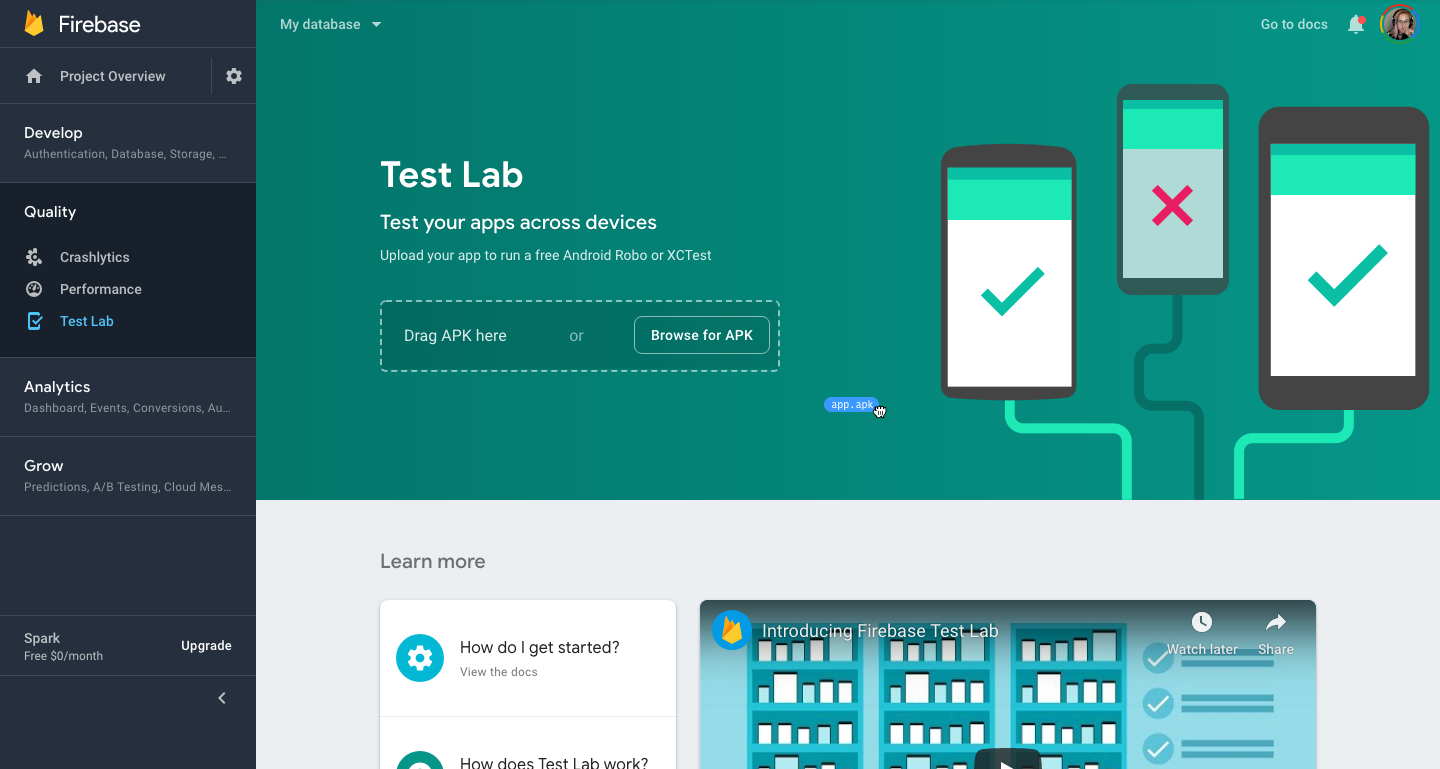
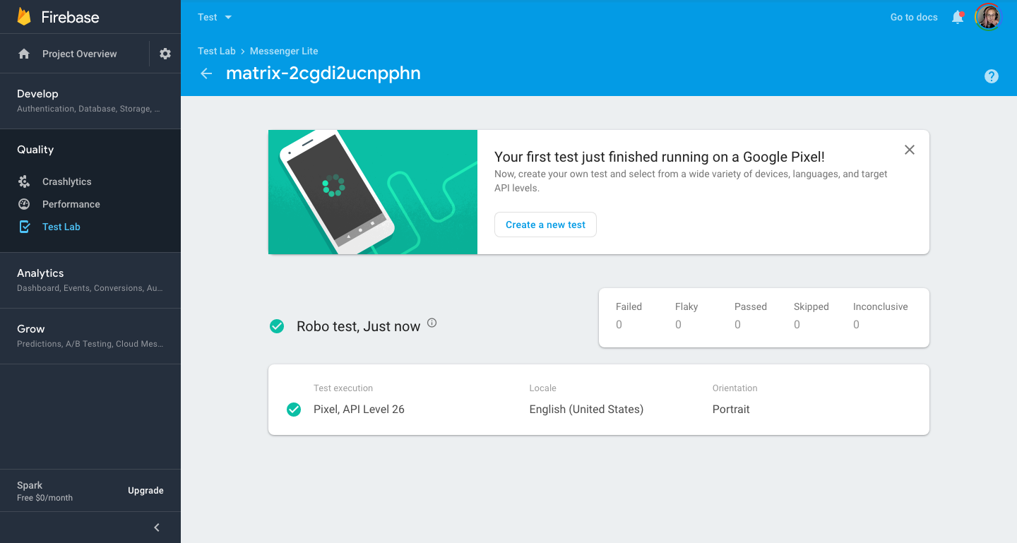
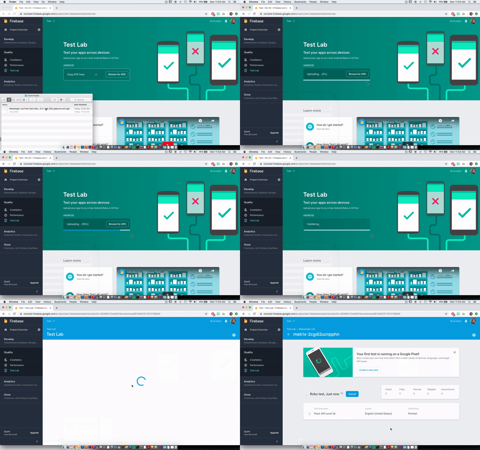
In the current “Run a Test” flow there are many selections to be made, from choosing devices and versions to test type. Removing these more involved steps would decrease the potential obstacles for a first time user. Already your first Test Lab run was free, so why not streamline the process even more by running it automatically? It was this brainstorming that led to a design eureka moment: what if you could just drag your app files onto the landing page and get back the test results in minutes?


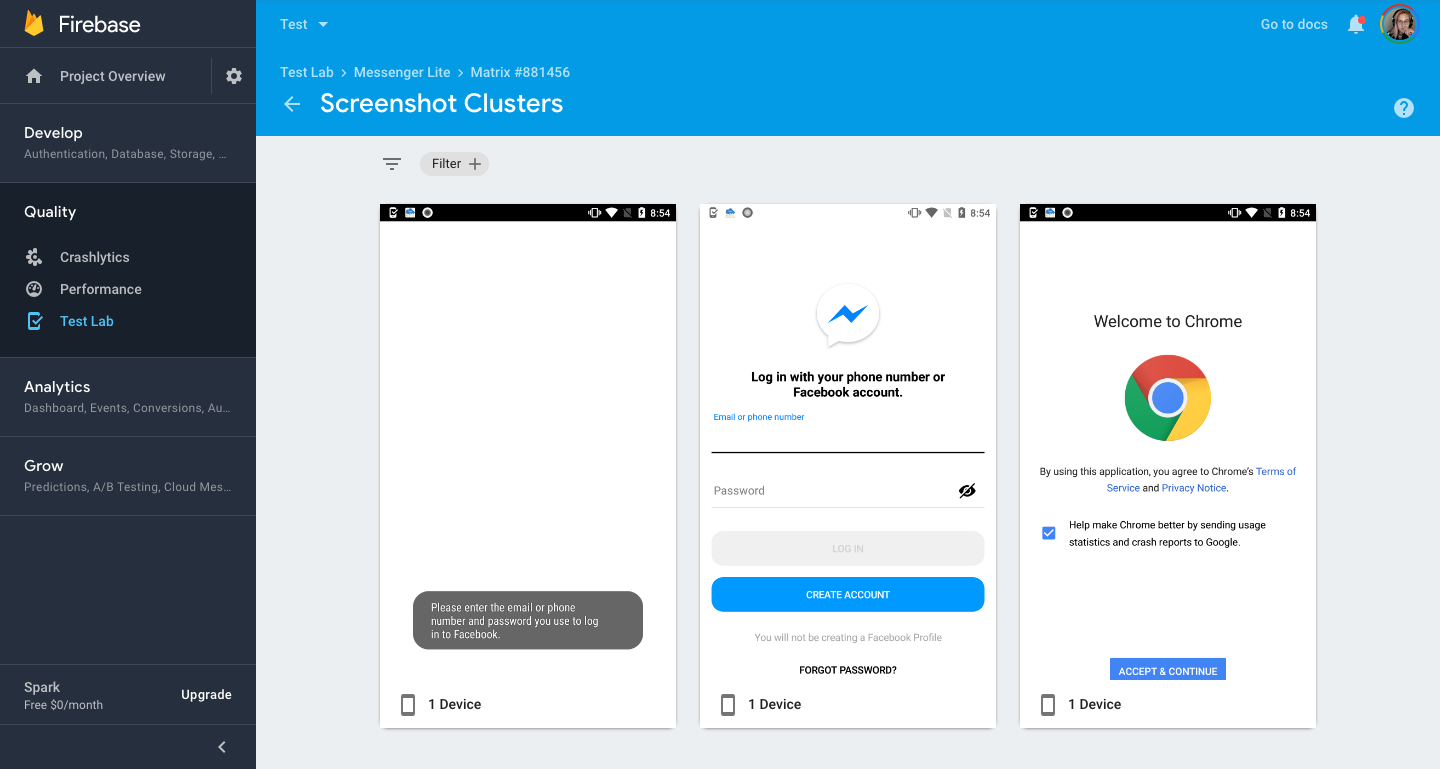
After mocking up the “Drop Zone,” user interviews proved critical to the process. I made revisions to the UX writing on the landing page, as well as refining error and success messages for test results. As well, the positive feedback from UX research helped get buy-in from the last few members on the team who were skeptical of changing the ‘front door’ of our product.

Success!
After teamwide approval, we rolled out the new experience through an A/B test. After enough data, it became clear that our idea actually decreased dropoff by 50%! New users were able to get started right away as long as they had an existing app, and existing users retained their usual workflow.
Surprisingly, Firebase did not allow dragging and dropping anywhere within its 20 features. By building a drag-and-drop component for this project, I was able to define the styles and behavior and improve UX across the entire platform.
