The Challenge
In 2016 Answers.com was going through a transformation from Q&A site to a digital publisher called Multiply. As the operation expanded, we amassed a large database of external freelance writers. However, there was no system for our freelancers to directly submit their articles, slowing down the publishing process and burdening our internal team of editors. Inspired by blogging sites like Medium.com, I got to work providing a better publishing experience for our external writers.


The Design Process
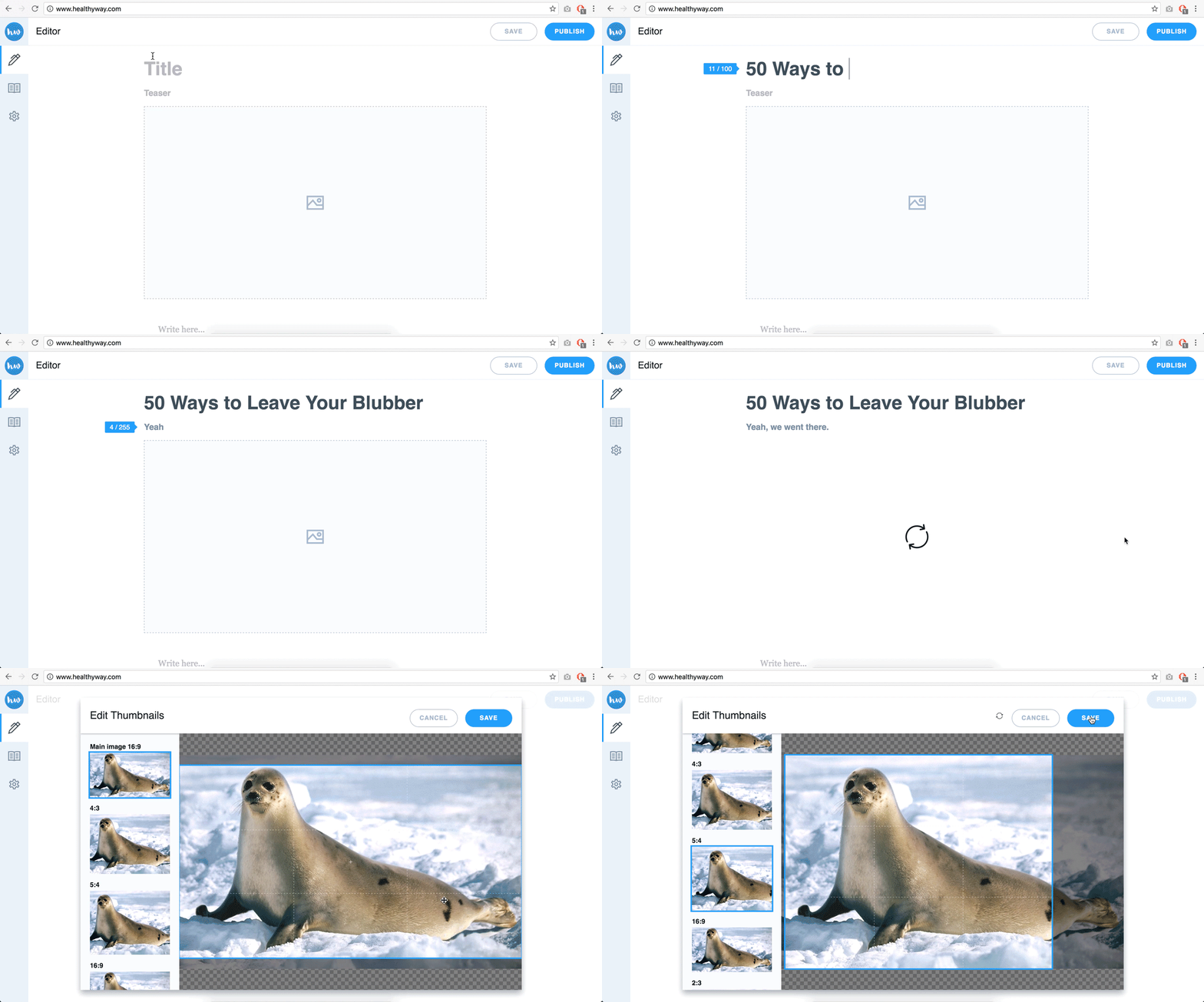
First, I some research on word processing standards and WYSIWYG (“What You See Is What You Get”) editors. I wanted the experience to be intuitive and meet user expectations, but also delight our writers when possible. Because the tool was so interaction-heavy, I spent many hours working closely with the front-end team to rapidly prototype rather than invest too much solo time in static mocks. As well, this was my first foray into icon design!
![]()
Rolled Out
After extensive design and engineering QA, the OSE was rolled out across Multiply’s 20+ domains, including popular sites like Healthyway and FashionBeans. The impact extended to the core of Multiply’s business, which involved partnering with influencers and celebrities to to bring their content to interested readers.
